{{ T["SLIDE_4/TITLE"] }}
{{ T["SLIDE_4/TEXT_1"] }}
{{ T["SLIDE_3/TEXT_1"] }}
{{ T["SLIDE_3/TEXT_2"] }}
{{ T["SLIDE_4/TEXT_1"] }}

{{ T["SLIDE_5/TEXT_1"] }}
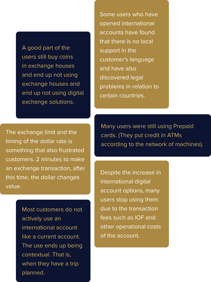
{{ T["SLIDE_6/TEXT_1"] }}
{{ T["SLIDE_7/TEXT_1"] }}
{{ T["SLIDE_8/TEXT_1"] }}
{{ T["SLIDE_9/TEXT_1"] }}
{{ T["SLIDE_10/TEXT_1"] }}
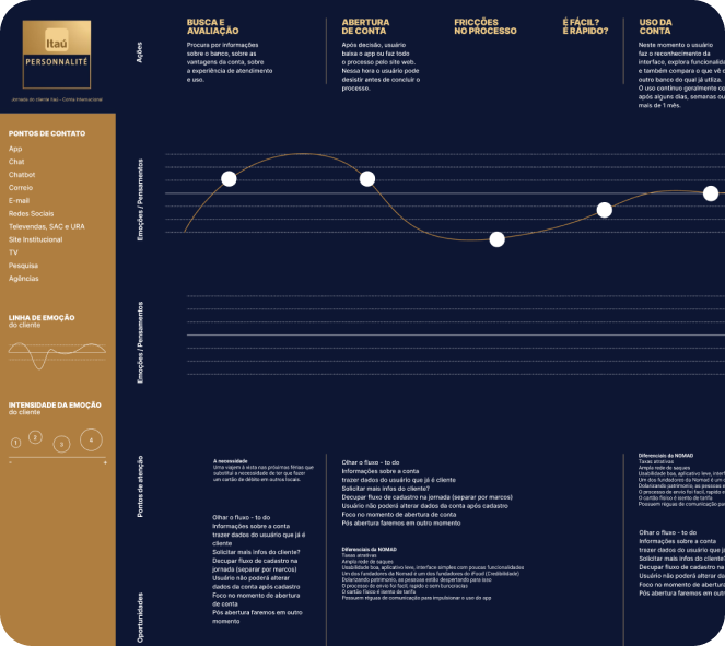
{{ T["SLIDE_11/TEXT_1"] }}


{{ T["SLIDE_12/TEXT_1"] }}
{{ T["SLIDE_12/TEXT_2"] }}
{{ T["SLIDE_12/TEXT_3"] }}
